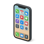
What is Responsive Web Design?
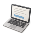 Responsive Web Design (RWD) is a web development process that ensures websites adapt to various devices and screen sizes, providing the best possible viewing experience across desktops, tablets, and smartphones.
This viewer experience is achieved through techniques such as fluid grids, flexible or swappable images, and CSS media queries.
Key Features of Responsive Web Design
Fluid Grids
 Designing with relative units like percentages instead of fixed units like pixels, allows elements to scale proportionally based on the visiting screen size.
Fluid grids are a system of design used primarily in responsive web pages. They allow page elements to expand and contract depending on the size of the screen or browser window. Here's a simple breakdown:
How They Work:
Instead of using fixed units like pixels (px), fluid grids use relative units like percentages (%).
This makes elements scale in proportion to changes in viewing screen sizes.
Example:
Let's say you have a web page with 2 columns:
In a fixed grid, each might be 500px wide, which doesn’t adapt well on small screens.
In a fluid grid, each column might be 50% of the container’s width, so it adjusts on tablets, phones, etc.
Flexible or Swappable Images
 Images expand and contract within their containing elements to prevent overflow and maintain design integrity across devices.
There are also swapping techniques using media queries that allow the use of various different sized duplicate images to be swapped out at set break points.
CSS Media Queries
These allow different styling rules to be applied based on device characteristics such as width, height, orientation, and resolution, simplifying tailored designs for differrent screen sizes.
Why Does it Matter?
- Responsive web design: Works on desktops, laptops, tablets, and phones.
- Better User Experience: Adapts to screen sizes without horizontal scrolling.
- Efficiency: One layout system for all devices.
How Important is Responsive Design?
 With the advanced use of mobile devices, responsive web design has become essential for ensuring usability and satisfaction. In 2015, Google began favoring mobile-friendly sites in its search rankings, highlighting the significance of responsive web design for search engine optimization (SEO).
Getting Started with Responsive Design
To implement responsive design:
1.Set the Viewport: Include the following meta tag in your HTML to control layout on mobile browsers:
The html in head section:
<meta name="viewport" content="width=device-width, initial-scale=1.0">
2.Use Relative Units: Always use percentages(dvw and dvh) for widths, margins and padding and ems or rems for font sizes instead of fixed units.
3.Apply Media Queries: Create CSS rules that adjust styles based on device characteristics.
NOTE: Modern web design is moving away from the overuse of media queries. Savy designers now use the clamp function to preset font-size, line-height, margins and padding.
 For example:

   @media (max-width: 768px) {
     .column {
       flex100%;
     }
   }

font-size: clamp(1.125rem,  1.125rem + .25dvw  , 1.5rem);