Free Web Templates
Flexbox and Dark Mode Toggle
Single Page
Our new series of templates are different than most free templates you'll find on the internet. They are not only teaching tools, but they are working examples of Columns with Flexbox, a Pop Up Modal Menu and a Dark Mode Toggle option.
Each template includes one of the 3 tier drop down menu systems from our free navbar collection.
These Semantic Templates also provide working examples of using the details function, a simple accordian menu , top button and back button.
They all use The Clamp Function to change font size, margins and padding for adjustments to smaller viewing devices.
We cater to beginners by using simplified HTML5 compliant code and we've tried not to be too overly zealous in the use of CSS.
Download a zip and run it through the Web Developers Emulator Tool. If you don't know what that is we provide a simple tutorial for finding it on your browser.
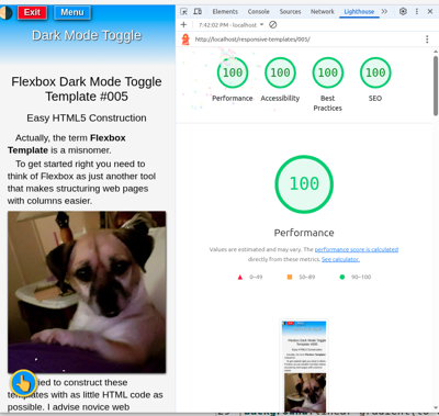
If you've set up a localhost, run them through Lighthouse.
They've all been tested on Lighthouse using our localhost and most scored 100 across the board light and dark mode, mobile and desktop.
Note: Scores for testing online will vary. (TBT and CLS)
Lighthouse will be inconsistent and frustrating for beginners, but insights can be helpful in some areas. It does have some 4 year old bugs that have never been fixed, so you will get some bogus reports. It should only be used as a guideline for improvement.
There is a link on each preview page for downloading the zip or you can use your back button to return and try another.
Use them as a learning tool or use them to start building your website. The Road to Responsive Web Design is at your beckon call.
🍀Best of Luck To All!!
Note: If viewing on a mobile device all of the templates will seem to be the same. The difference in drop down menus can be viewed on some tablets and all larger devices.
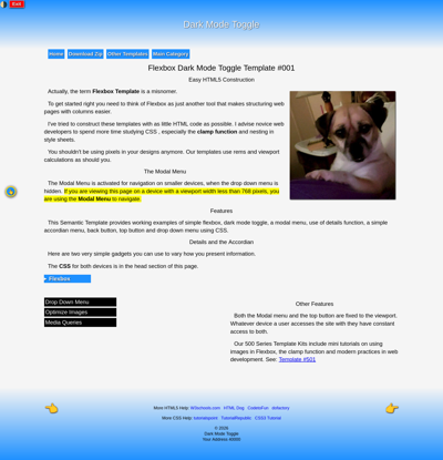
Flexbox Dark Mode Toggle
Preview Template #001
Download the Zip
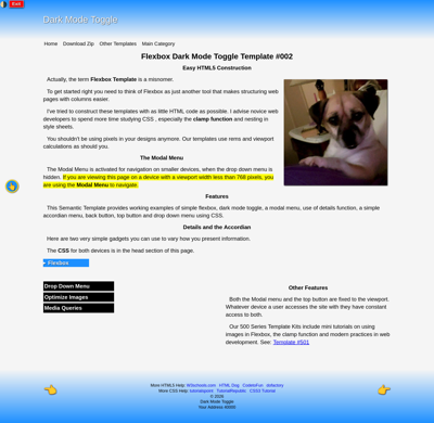
Flexbox Dark Mode Toggle
Preview Template #002
Download the Zip
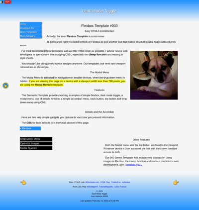
Flexbox Dark Mode Toggle
Preview Template #003
Download the Zip
Flexbox Dark Mode Toggle
Preview Template #004
Download the Zip
Flexbox Dark Mode Toggle
Preview Template #005
Download the Zip
Flexbox Dark Mode Toggle
Preview Template #006
Download the Zip
Click the Next Finger for More Templates