Using Web Developer Tools
📖 Resizing the Browser Manually
Also Testing the Clamp Function
In order to start this lesson your browser is going to have to be in what I call Resize Mode. You can toggle between Resize and Full Screen by clicking the square box in the upper right corner of the browser.  .
.
You know you're in Resize Mode when you hover the mouse pointer over the right edge of the browser and the curved triangle and vertical line or the double arrow on Windows 11 appear. Then hold down the left mouse button and you will be able to resize the window horizontally.
Now while still in Resize Mode, you want to Open Developer Tools.
- Chromium use: CTRL-SHIFT-j or F12
- Edge use: CTRL-SHIFT-j or F12
- Opera use: CTRL-SHIFT-j or CTRL-SHIFT-c
- Firefox use: F12(then you're on your own)
**Got NO USE for LINUX Chrome or Firefox**
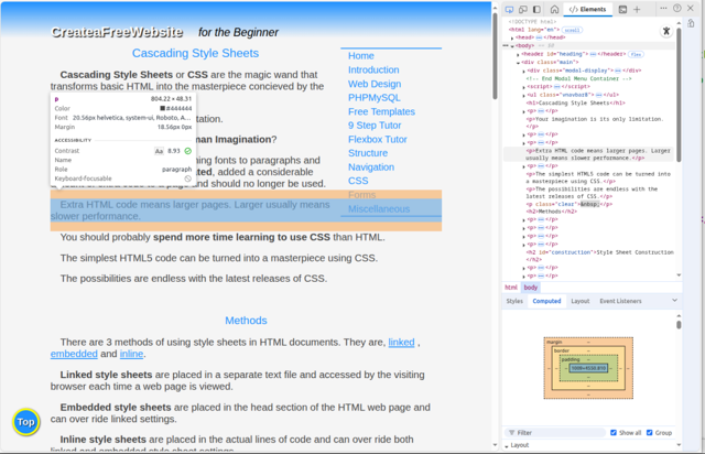
You should be looking at a split screen with Developer Tools in a right hand side bar.
Shrink and Grow the Page
Now hover the mouse pointer over the border between the web page and the sider bar until you see a double headed arrow.
Grab the edge as you did on the right edge of the browser window by holding down the left mouse button.
Start squeezing the web page to the left and watch above the scroll bar between page and sidebar.
The width of the web page is displayed as the page is flexed.
👉Note:If the web page doesn't expand and reduce as you move the double arrow from side to side, it's most likely the Emulator tool is turned on. Find the icon and toggle it off. If you don't know how to find the icon see: Emulator Tool
We can use this process to determine the break points we'll use with our Media Queries or testing our preset values using the Clamp Function.
Testing the Clamp Function
Like to know if your preferred(algorithm) is working properly?
You can test font-size, padding and margins with little effort. Line-height can be checked also, it's just a little harder to find.
NOTE: I'm working on Linux and I recommend the Edge, Chromium, and even Opera over Fire fox for using Web Dev Tools. Instructions will be for those three browsers.
You've opened Web Dev tools by by pressing F12. Now press Ctrl-Shft-c
Opera : Set you cursor somewhere on the desired web page and press Ctrl-Shft-c (Opens WD tools and the function we're using to test.)
For all 3 browsers, hover over the desired element you want to test on the web page. A simple dialog box appears with the information you're looking for.
You can even hover open areas to see readings for padding and margins.
Manually shrink and grow the page and watch to see if your algorithm stays in range.

More Helps
You should begin to test the web page with the Emulator Tool.
At this point you should also be checking your code in the W3C Validator.
Need something more advanced? Check out our Web Development Resources page for some more advanced tutorials and reference guides for HTML5, CSS3, Responsive Design and SEO.