How to Create a Web Page
📖 Add an Image to a Web Page
You should complete these lessons in order. If you haven't completed the first 5 exercises, go back and start at the beginning. Exercise #1
👇 Did You skip This Step?
Note: Way back in Exercise 1 we told you to create a special folder named htdocs to store your web pages in. I also instructed you to create an images folder INSIDE it. If you didn't, do it now!
The htdocs/images folder is where you will store all of the image files that you want to appear on your web pages.
Notice that the src attribute in the code includes the path to the images folder.
<img src="images/image.jpg" alt="a description">
This tells the browser where the picture named image.jpg will be located.
The alt="" attribute is REQUIRED on all images that you add to a web page!! Include a brief description of the image between the quotations.
You should not include the width and height of the image in Responsive Design.
Sixth Exercise
Adding an Image
In this lesson, we'll add an image to our web page.
Copy and paste the code in drk red into your HTML code in the space left after the 1rst block of text. You may need to create the space.
<h2>Single Column Layout</h2>
<p>We can use this single column layout to learn a little about Responsive Web Design.</p>
<p>RWD came along about 10 years ago when surfing the internet with cell phones began to be an every day habit. A need for web design that allowed the same web site to be viewed on a desk top , laptop, tablet or cell phone was a must. What was then Liquid web design evolved further into what today is the norm as RWD.</p>
<p>If you want to learn the art of creating columns, proceed to the Flexbox Tutor after you finish this tutorial.</p>
<h2>Easy HTML5 Construction</h2>
<p>I've tried to construct these templates with as little HTML code as possible. I advise novice web developers to spend more time studying CSS. </p>
<p>The only limit to what you can do with modern CSS is your own imagination.</p>
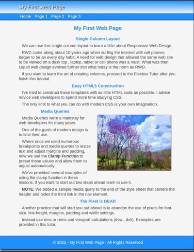
<img src="images/image.jpg" alt="Our place on a sunny day.">
<h2>Media Queries</h2>
<p>Media Queries were a mainstay for web developers for many years.</p>
<p>One of the goals of modern design is to limit their use. </p>
<p>Where once we used numerous breakpoints and media queries to resize text and adjust margins and padding, now we use the <b>Clamp Function</b> to preset those values and allow them to adjust automatically.</p>
<p>We've provided several examples of using the clamp function in these lessons. If you want to start out two steps ahead learn to use it.</p>
<p><b>NOTE:</b> We added a sample media query to the end of the style sheet that centers the header and hides the third link in the nav element,</p>
<h2>The Pixel is DEAD</h2>
<p>Another practice that will start you out ahead is to abandon the use of pixels for font-size, line-height, margins, padding and width settings.<p>
<p>Instead use ems or rems and viewport calculations (dvw , dvh). Examples are provided in this tutor.</p>
<p class="spacer"> </p>
🔴 Save myfirstpage.html
Defining the Image in the Style sheet
Copy and paste the code into your style sheet below the footer p closing bracket.
img {
max-width: 100%;
float: right;
margin: 2rem;
box-shadow : 1px 2px 4px #000
}
🔴 Save myfirstpage.html
The float: right setting does what it says. It floats the image to the right side of the division.
The margin settings, margin : 2rem keep text from running up against the picture when displayed..
Download the Image
Now copy the image, save it in your htdocs/images folder and view the web page in your browser.

Save as: image.jpg
👉Note: Both Linux and Windows users should be able to open the images folder next to this page and drag the image into the folder.
The method of display here uses max-width : 100% and then allows it to scale down in size at different viewing widths.
👀 Preview the Web Page
The Result
If this is what you see you are ready to continue:
Were you successful?
If not, check the code that you added to your HTML page and style sheet.
It is very difficult for beginners to see errors in their code.
If you haven't started yet run the code through the W3C Validator
If your web page is not working properly at this point and can't find your errors, I recommend that you delete your work and start over at the beginning of the tutor.
Don't go to the last lesson on adding a Top Button if your page is not working properly.
Adding a Media Query
The media query is set to activate at a viewing width of 496 pixels. It will do three things.
1...It hides the third link before it wraps.
2...It centers the header text.
3...It changes the settings on the image so that it centers on mobile devices.
Copy and Paste this Media Query below the last entry.
@media (max-width: 31rem) { /* 496px */
	a.hide {display : none}

header p {
	text-align: center
	}
img {
display: block;
float: none;
margin: 2rem auto
}
	}
🔴 Save myfirstpage.html
👀 When viewed in your browser at 360 pixels this is what you should see:
Test Your Comprehension
💡Take a quiz on the information presented so far.
What's Next
In the last lesson we'll learn to add a Top Button.
If you're satisfied with your progress, let's finish the page
Need something more advanced. Check out our Web Development Resources page for some more advanced tutorials and reference guides for HTML5, CSS3, Responsive Design and SEO.