How to Create a Web Page
📖 Adding a Menu for Navigation
You should complete these lessons in order.
If you haven't completed the first 3 exercises, go back and start at the beginning.
If you are going to have more than one page in your website, your users will need an easy way to navigate the pages.
Your navigation device will be contained in your nav element.
We will use simple anchor tags and enhance them with CSS.
Fourth Exercise
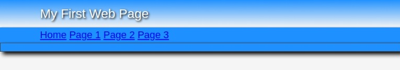
Copy and Paste the code shown in drk red inside the nav element of the body section as shown:
<nav>


<a href="#">Home</a>
<a href="#">Page 1</a>
<a href="#">Page 2</a>
<a class="hide" href="#">Page 3</a>

</nav>
🔴 Save myfirstpage.html
👀 You should really look at the page before you add the settings to the style sheet to see how it changes the appearance.
Copy and paste below the last entry in your style sheet.
nav a {
	padding: 1px 5px;
	color:#fff;
	border: solid 2px dodgerblue;
	text-decoration:none;}
nav a:hover {
	text-decoration:none;
	border: solid #fff 2px;}
🔴 Save myfirstpage.html
👀 Now preview the web page and see the changes.
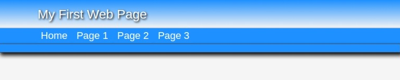
Amazing? Run the mouse pointer over the buttons. A little action created by changing the border colors in the a and a:hover definitions
Are you beginning to see the POWER of CSS? Modern CSS is limited only by your IMAGINATION. Don't let AI turn you into a potato head.
Just a bit of Content
Let's add a little content to the main element.
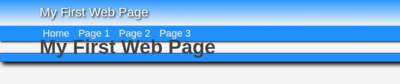
Copy and Paste the code shown in drk red between the <main> </main> tags.
<main>

<h1>My First Web Page</h1>

</main>
🔴 Save myfirstpage.html
👀 Refresh and Preview
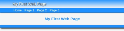
Copy and Paste this code below the last entry in your style sheet:
main h1 {
	/* 24 to 36 px */
	font-size: clamp(1.5rem, 1.5rem + .5dvw , 2.25rem) ;
	/* line-height is 1.2 to 1.5 X size of text */
	line-height : clamp ( 1.8rem , 1.8rem + .5dvw ,  2.7rem);
	color : dodgerblue;
	font-weight : 600;
	margin: 2rem 0;
	text-align: center
	}
🔴 Save myfirstpage.html
👀 Refresh and Preview
The Result
If this is what you see, you are ready to continue:
👉
Were you successful?
If not, check the code that you added to your HTML page and style sheet.
Test Your Comprehension
💡Take a quiz on the information presented so far.
Ready to Proceed
When you get everything working with the desired result in your browser, you are ready to proceed to the next exercise.
Don't be afraid to delete all your work and start over from the beginning!
Don't go on unless you have a basic understanding of the procedures presented so far.
What's Ahead
Next we'll add more content and then we'll finish the footer.
More Helps
If the information on the Clamp Function is confusing, you might want to take a time out and study the simple Tutorial we provide. Clamp Tutor
Need something more advanced. Check out our Web Development Resources page for some more advanced tutorials and reference guides for HTML5, CSS3, Responsive Design and SEO.