Division Tag in HTML5
Out with the Old in with the NEW
Things have changed a lot in the last few years in the area of web development.
I've left the old methods in place for you to skim and see just how much the process has changed and how much easier creating columns with Flexbox has become.
Try one of our mini site templates Each includes a short tutorial on creating columns with flexbox. And each page is a working example.
The Code
The division tag: <div></div>.
The KEY to mastering web pages is learning to manipulate box elements.
Divisions are just one of many box elements used in web page constuction.
👉Note: HTML5 added several new box elements that make coding web pages a lot easier. Among them and the most useful for beginners: header, nav and footer.
There is also a main box element which is rarely used because of its restrictions.
To make box elements easy to understand, think of them as boxes with 4 sides.
You can stack these boxes or align them side by side to create a unique structure for a web page.
You can control the position of the box , its size, background color and add padding, borders and margins using simple CSS (style sheets).
Use the class attribute to create divisions needed for procedures like defining columns.
The NEW
<header></header>
<nav></nav>
<main></main> /*Not New but Rarely Used*/
<footer><footer>
The OLD
<div class="header"></div>
<div class="nav"></div>
<div class="main"></div>
<div class="footer"><div>
The Class Attribute
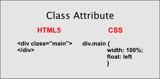
The class attribute, class="name of element", is used to give a name to a page element so that it can be referenced in the style sheet in order to create a customized version of the element.
The diagram shows how it is defined in the style sheet.
The name of the element is preceded by div..
Tip: You can omit the div and use .main, .right .left but it can become confusing if not a unique name.
Nesting Elements
Multiple divisions can be nested inside of a container division to create columns on a web page.
Note: Container divisions are optional and a matter of the taste of the designer. Try structuring your web page with and without using containers. The principles expressed below for adding margins, padding and borders hold true for either method.
Read also: nesting web page elements
Divisions are wisked into place using the float property.
Note: We repeat. Use the class attribute, to name or identify your divisions.
Basic Code for a Web Page
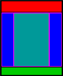
<!DOCTYPE html>
<html>
<head><link rel="stylesheet" href="style.css" type="text/css"></head>
<body>


<header></header>
<div class="main">
<div class="left"></div>
<div class="content"></div>
<div class="column right"></div>
</div>
<footer></footer>

</body>
</html>
*header and footer are new elements of HTML5. They are not required, but are viable options for the division tag.
The code shown above is for a 3 column web page with header and footer like the diagram shown on the left.
*The main division is considered a container division and is optional.
The size and alignment of all the divisions is controlled using a linked style sheet.
The OLD Method of Creating Columns
Adding Margins
🕛
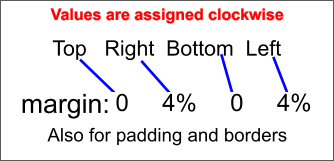
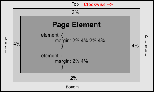
Margins or padding keep the text and images of adjacent divisions from running up against each other.
div.content {
width: 68%;
margin: 0 4% 0 4%
}
abbreviated
margin: 0 4%
Centering Multiple Columns
Since we're building liquid web pages, centering isn't really a problem.
I prefer compact web pages that don't spread out the full width of the browser window when viewed at high resolutions.
I use the max-width property on the body to keep the web page from spreading out more than 1200 pixels. You can use any page width.
The page will be constrained at 1200 pixels, but will still adapt to the width of the viewing device at lower resolutions.
Add the max-width property to your body setting
Then center the body in the browser window using the margin: 0 auto method.
You can add a margin to the top if desired to keep it from laying against the top of the browser window: margin: 1% auto.
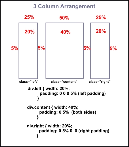
HTML code
<div class="left"></div>
<div class="content"></div>
<div class="column right"></div>
CSS
body {
max-width: 1200px;
margin: 0 auto }


div.left {
width: 20%;
padding: 0 0 0 5%;
float: left}


div.content {
width: 40%;
padding: 0 5%;
float: left}

div.right {
width: 20%;
padding: 0 5% 0 0;
float: left}
FlexFix: A 3 column page with sidebars can be created in flexbox with code similar to:
The CSS
div.container {
display: flex;
justify-content: space-between;
gap: 2dvw;
box-sizing : border-box
}
div.column {
flex : 1;
}
div.column3 {
flex: 3;
}
The HTML
<div class="container">
<div class="column"></div>
<div class="column3"></div>
<div class="column"></div>
</div>
Important! The combined widths of nested divisions or all adjacent divisions must not exceed 100% of available space.
If you add padding or margins, you must subtract their values from the width of that division or from the width of an adjacent division.
Problems with Aligning Adjacent Divisions
Beginners will run into problems getting adjacent divisions to line up side by side.
If you can master this concept, you can master the art of building web pages.
Everything you add to a division, margins, padding and borders, adds to its size.
Starting out, don't use borders on adjacent divisions used for building the structure of the web page. Get a little experience before you try it! (Requires an estimation of width settings)
FlexFix: Add the code box-sizing: border-box to the style sheet and borders, margins and padding are automatically calculated into the containers width.
Why We're Using Percentages
Most of the tutorials you've visited teach you to use absolute values for defining widths of divisions.
A typical absolute width for a division would be 1000 pixels, coded as 1000px.
If you set the width of your static web page to 1000 pixels, it stays at 1000 pixels no matter what device is used to view it.
If someone viewed the site using a tablet with a viewing resolution of 800x600, they would see 800 pixels of your 1000 pixel web page and would have to scroll to the right 200 pixels to view the rest of the web page.
If someone with a high end game machine viewed the site at a resolution of 1920x1200, your web page would only fill about half the width of their browser window.
Now say someone using an Android or a much smaller device with a resolution of about 320x260 pixels viewed your site. How much of your 1000 pixel web page are they going to see?
If you set the width of your web page to 100dvw and height to min-height: 100dvh, it uses 100% of available browser space.
If it is viewed at a resolution of 320x260 it adjusts to that viewing width.
If it is viewed at a resolution of 800x600 it adjusts to that viewing width.
If it is viewed at a resolution of 1920x1200 it adjusts to that viewing width.
Web pages that use absolute values for setting their width are called static or fixed width web pages.
With the advent of more and more new devices of different sizes and resolutions being used to surf the web, fixed with web pages, like frames, will eventually end up in the W3C grave yard.
Don't build fixed width web pages!!
👉Note: You must also include the viewport meta tag in the head section of each web page that uses relative values and other responsive design techniques. This meta tag signals the visiting browser to adjust page width, resolution and orientation to that of the viewing device.
<meta name="viewport" content="width=device-width, initial-scale=1">
See also: Nav Element and Footer Element
Visit our 7 Step Tutorial for creating easy Flexbox Web Pages.