🔗Anchor Tags and Images as Links
The image tag is actually an anchor.
It is used to add an image to a page at a desired location.
It can also be used as a link to another document or image.
The code:
<img src="image.gif" alt="alternate text">
This code simply displays the image.
Required Attributes: (There are only 2 in HTML5)
src path/filename of image
alt Brief description of image
*All other attributes are set using style sheets.
Approved Alignment Methods
The float property
<img src="sam.gif" style="float: left / right" alt="text">
The margin for centering
<img src="sam.gif" style="display: block; margin: 0 auto">.
Other Possible Attributes
border Set in style sheet.
box-shadow Set in style sheet.
display: block/inline Set in style sheet. (very handy)
Image as Hyperlink
To use an image as a hyperlink, the code is:
<a href="samesite.htm"><img src="image.gif"></a>

Actual code: Id attribute was used in the header tag at top of page:
<a href="#heading">&l
<header id="heading"></header>
Image Viewer
HTML/CSS Only
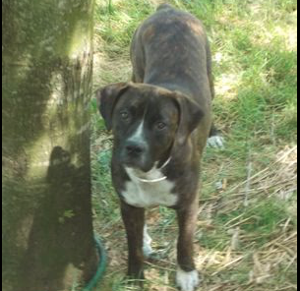
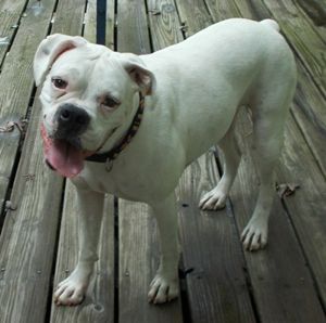
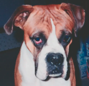
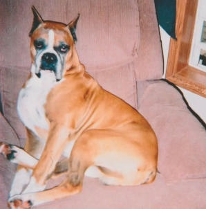
Use Thumbnail images to display larger images.
Click on the Little Friend to see the Big Friend in the iframe below.
Link Code
<a href="images/buddy-300.png" target="picdisplay">
<img src="images/buddy-2-100.jpg" alt="Buddy"></a>
iframe code
<iframe class="iframeview" name="picdisplay"></iframe>
CSS
iframe.iframeview {
display:block;
width: 302px;
height:302px;
margin: 0 auto;
box-shadow: none;
}
Download Image Viewer Kit Now includes an Image Carousel with 12 sample images.
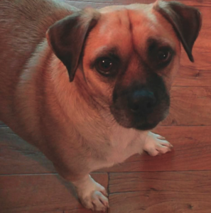
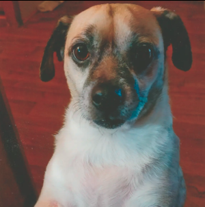
Display in a New Browser Window
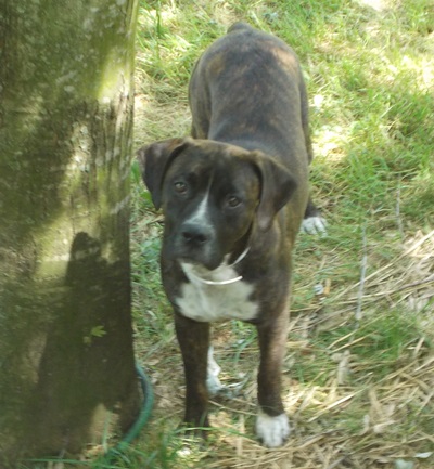
You can also choose to have the larger image open in a new browser window.
Click the little Buddy again to see what it does.
The Actual HTML5 code
<p><a href="images/big-buddy.jpg" target="_blank"><img src="images/little-buddy.jpg" alt="Little Buddy" style="float: left;box-shadow:4px 2px 6px #010101; border: none"></a></p>
Inline Icons as Links
HTML5 makes adding images inline a little easier.
We'll demonstrate by creating an image class.
Click the icon 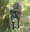 find out more about using pictures in HTML pages.
The Basic HTML5 code
<p><img src="" class="inline" alt=""></p>
The CSS
img.inline {
  display: inline;
  border:none;
  box-shadow:none;
  padding: 0 2px;
  margin: 0 0
}
Actual HTML5 Code for this Link
<p>Click the icon <a href="paragraph_images.html"><img src="images/buddy-2-100.jpg" class="inline" style="max-width: 25px" alt="buddy icon"></a> and find out more about using pictures in HTML pages.</p>
And Then Came Wing Dings
It's very easy to use WingDing images as links. I place them in paragraphs here and use the title attribute to tell the user where the link goes. I've tested them on Windows, Linux and cellphones.
Some links will take you to another page. Just use the back button to return.
<p><a href="#heading" style="text-decoration:none" title="Go to top of Page"><span style="font-size :40px; text-shadow: 1px 1px 2px #000">👆</span></a></p>
<p><a href="index.html" style="text-decoration:none" title="Go to Home Page"><span style="font-size :40px; text-shadow: 1px 1px 2px #000">🏠</span></a></p>
<p><a href="color_chart.html" style="text-decoration:none" title="Go to Color Chart"><span style="font-size :40px; text-shadow: 1px 1px 2px #000">🎨</span></a></p>
<p><a href="anchor_tag.html" style="text-decoration:none" title="Go to Links and Anchor Tag"><span style="font-size :40px; text-shadow: 1px 1px 2px #000">🔗</span></a></p>
We use lists of anchor tags to create our Drop Down Menus
SeeAlso: Unordered Lists
Free Bullet Images and WingDings for Unordered Lists
🔵 🔶 😀 🎈 🐝 🏀 👉