How to Create Web Pages with HTML5
HTML5 Web Pages
This 7 Step tutorial will teach you to create HTML pages using a simple hands on approach.
You will copy and paste HTML5 code into your NotePad editor, then enhance its appearance using CSS (cascading style sheets).
About the Web Page You'll Build
You say, "It's BLACK!"
I've tried for years to get people to use more color in websites. For the most part the internet remains white and static.
If you want color, you can change the stylesheet. Static, you won't get!
The web page you'll build here will introduce you to the world of RWD.
Responsive Web Design? This web page when finished won't just be liquid. It will be mobile ready.
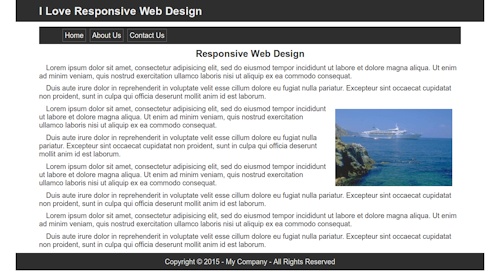
RWD means if some one pulls the page up on a desk top or laptop it will display like the picture above.
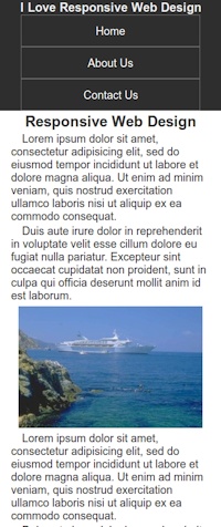
If some one accesses it with a cell phone it adapts its appearance to the picture on the left. Complete with functional drop down menu.
Hey! You want color add it.
You still want to build a static website? Get ready to join the ranks of the future internet 'Walking DEAD'
Getting Ready
This first group of tutorials is for the ultra novice.
If you don't need them you can bypass them or come back to them if you get stuck.
- How to find Notepad
- How to Use a Text Editor
- How to Copy and Paste
- How to Preview Your Pages in a Browser
- How to Create Folders on Your Computer
Note: Mac users should use the text editor included with Apple systems
Linux users have LeafPad.
How to Use this Tutorial
Read ALL
INFORMATION and then execute the Exercise
at the bottom of each page.
Don't Skip Anything!!
Complete all 7 exercises.
Important
If you just run through the tutorial copying and pasting, you won't learn a thing.
Examine the HTML code, then 'copy & paste'.
Preview the page before you add the CSS.
Examine the CSS and try to see how it relates to the HTML code, then 'copy & paste'.
Preview the page again and notice the changes in appearance.
DO NOT USE WYSIWYG editors like Komposer, Seamonkey etc!!!
Get Organized!!!
Important: Create a special folder to store your HTML and CSS pages in.
Name it something like htdocs.
Make it easy to find. Create it right on your c drive as c:\htdocs
Create another folder INSIDE the c:/htdocs folder.
Name it images.
This will help you to start out in an organized fashion and find the page with your browser when previewing.
You will save pictures that we provide in Exercise 6 in the c:/htdocs/images folder.
HTML5 Code
The secret to learning HTML code is to USE AS LITTLE AS POSSIBLE!
You should spend as much time or more learning about CSS (cascading style sheets).
The Basic HTML 5 Page
This is all the code you need to get started.
The code in red will provide the location for your embedded style sheet.
The viewport meta tag tells the browser, "Hey, you can send this page to a cell phone screen. We ready!"
 <!DOCTYPE html>

<html>

<head>

<title>Title is required</title>

<meta charset="utf-8"/> <!--Required for
W3C Validation-->

<meta name="viewport" content="width=device-width,
initial-scale=1">

<style type="text/css">


</style>

</head>

<body>

</body>

</html>
Building Your Page Structure
Because so many people are viewing websites on cell phones these days, I've modified this tutorial to include an introduction to Responsive Web design.(Lesson 7)
Liquid pages expand and contract with the size of a visiting browser.
RWD web pages conform to the different monitor resolutions used by devices like cell phones, tablets and small notebooks.
Note: It is a short step from liquid to mobile ready and RWD.
Responsive Web Design or a website that can be viewed in any device is the future of web design. Complete this tutorial and you will be moving in the direction of the future. Static design is dead!!!
The entire structure of our HTML page, its rows and columns, will be defined using divisions and relative values (percentages).
What's that? For now, think of divisions as 4 sided empty boxes on your page that you are going to fill with pictures and text, even videos.
CSS (Cascading Style Sheets)
The more you learn about CSS, the more sophisticated a website you will be able to build.
You can, however, create a very impressive website by just learning the basics.
What the CSS Does
The best way to see what the CSS does is to preview the web page before and after you add the CSS.
We will provide an explanation of what each line of style text does for those that need it.
Head and Body
Every web page is divided into 2 sections. Head and Body.
The Head section is at the top of the page and contains data mostly for the browser. People won't see the stuff you add to your head section.
Information in the head section lives between these 2 tags: <head> </head>.
Our Stylesheet will live there.
So, when I say, 'Copy and Paste into the stylesheet', you'll be pasting into the head section between the style tags shown above in red.
The Body section is always under the Head section. The HTML Code for the body section lives between these 2 tags: <body> </body>
Summarize it: Paste CSS in the top - HTML code in the bottom.
Okay Already! A lot less talk and a lot more DO ahead.
Before You Start
We went a step beyond the call and made the tutorial liquid.
If you're working on a nice big desk top or lap top you can set the tutorial up just like this.
Open the tutor in your browser and place the tutor on the left.
Notepad Set Up
 Open
Notepad and place it on the right.
Open
Notepad and place it on the right.
Paste your HTML code and CSS in the Notepad editor on the right. We'll use an embedded stylesheet to simplify the process.
Note: My setup is on Linux, so I use LeafPad.
See: How to Preview Your Pages in a Browser
Ready to work? Start the first Exercise!
First Exercise
You're going to create an html file in this exercise.
Saveit in your c:\htdocs folder.
HTML5 Design
Copy and Paste into NotePad
This is the HTML code:
<!DOCTYPE html>

<html>

<head>

<title>I Love Responsive Web Design</title>

<meta charset="utf-8"/>

<meta name="viewport" content="width=device-width,
initial-scale=1">

<style type="text/css">
* {
padding: 0 0 0 0;
margin: 0 0 0 0
}

body {
max-width: 1200px;
margin: 0 auto;
color: #333333;
background: #ffffff;
font-family: arial, tahoma, verdana, serif;
font-size: 18px;
font-style: normal;
font-weight: normal;
}
</style>

</head>

<body>


</body>

</html>
Save the web page as firstpage.html
The .html extension is crucial.
Once you save the HTML page you can look at the page with a browser. Right now you'll get a blank white page.
Style Sheet Design
We'll use an embedded stylesheet (located in head section of document) to simplify the process for now.
Explanation
The first block closes all gaps in your displayed code. It removes any default values for margins and padding for elements that you add to the code of the page.
The second block of CSS defines the body section of the web page.
Max-width: - sets the maximum width that the page will spread out.
I've set it to 1200 pixels because I prefer a compact design when the site is viewed on high res machines.
If you have the luxury of a high resolution monitor you can experiment with setting it wider. (1500, 1600 etc. pixels)
margin: 0 auto - centers the body within the viewing browser window.
If you are working on a low resolution machine say 800 or 1024 pixels the web page will adjust to your browser window.
The line, color: #000000 defines the default color of text elements like paragraphs and header tags.
The background color is defined in hexidecimal code #ffffff and produces the white color you'll see when you preview the page.
 We also
define the default font settings for the web page.
We also
define the default font settings for the web page.
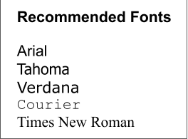
font-family: arial, tahoma,
verdana, serif;
If we define the default font-family at the top of the style sheet we can experiment with the different font faces by simply changing their order.
Place your preferred choice first in the list.
We set font-size to 18 pixels, font style and weight to normal.
The Result
Future Web page builders will see an empty white colored browser window.
Were you successful? If you were, congratulations!!
If you see code in your browser, you probably saved your page with a txt extension.
If you typed the code instead of pasting you may have errors.
Check the extension of your saved file. It should be .html
Go back and read the information again. Don't skip any steps.
If you are using a WYSIWYG editor, GET RID OF IT!!
If you are using an HTML editor that doesn't support HTML5, get rid of it. It will probably trash your code.
For best results copy and paste the HTML code and CSS for now.
The HTML code and CSS must be exactly as shown.
Helps
If you missed the tutor on previewing HTML pages with a browser and are having problems, Visit that tutor now.
I don't see my pages!!!
If using Notepad to build your pages, you save them and come back later and they aren't there, click the All Files filter. Notepad only shows your txt files by default.
QuizTime
Test Your Comprehension
Take a quiz on the information presented so far.
Ready to Proceed
Are you comfortable with your tutor set up? Make adjustments now.
When you're comfortable and get everything working with the desired result in your browser, you are ready to proceed to the next exercise.
Don't go on unless you have a basic understanding of the copy, paste, save and preview procedures presented so far.
If you find any errors in this tutorial, please report them to Charles.