Division Tag
Manipulating Divisions
Anything you add to a division in the way of margins, border or padding adds to the size of the division.
In the 4 examples shown below, let's say that the first red box is a division.
It's width is set to 33%
It has no margins, padding or borders.
In the second box we add a 4% margin to the outside of the division, original width 33%.
This increases the width of the division to 41%. (2 sides at 4% each)
In the third example we add 4% of padding to the inside of the division.
This stretches the division out to a measurement of 41%. (2 sides at 4% each)
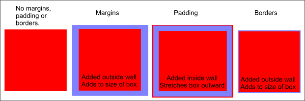
In the last example the width is set to 34% and we add a simple 1 pixel border.
This increases the size of the division to greater than 34%.
Note: Area in blue represents spacing in percentages added by margin, padding and border.
What's the Problem
In the method we are using to align adjacent divisions, if the combined width of the nested divisions, plus margins, padding and borders, exceeds the width of their container, your page will look like this:
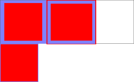
Say the white box is your container division. Its width is set to 100%.
With the dimensions specified in the examples shown above where we added padding, margins and border, the combined width of your nested divisions is greater than 116%.
The combined width of the first 2 divisions is 82%.
The third nested division is 34% wide plus the width of the border and does not fit inside the remaining available space of 18%.
It misaligns to a position below the first 2 divisions.
This is why you must adjust the width of your nested divisions if you add margins, padding or borders.
The Fix
To get the nested divisions to line up inside of the 100% wide container division, we show the adjusted widths in the CSS shown below:
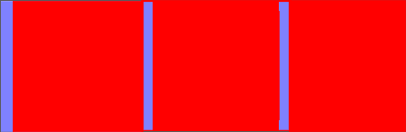
#division-left {
float: left;
width: 29%;
margin: 0 0 0 4% }
#division-middle {
float: left;
width: 25%;
padding: 0 4% 0 4% }
#division-right {
float: left;
width: 34%;
border:none
}
29% + 4% + 25% + 4% + 4% + 34% = 100%
**Don't use borders when building the structure of your web page. You can place your borders on interior elements.
Controlling Overflow
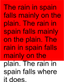
When using fixed height divisions,(and you shouldn't) you must control the amount of content that you place within a division.
If you add too much content you'll get a result like the diagram shown on the left.
This phenomenon is callled overflow.
One solution would be to redefine the height of the division to allow for the content.
Another solution would be to use the overflow property when formatting your division.
Either of the examples shown below will produce scroll bars on the affected division.
#division-middle {
float: left;
width: 50%;
height: 200px;
padding: 0 0;
overflow : scroll
}
#division-middle {
float: left;
width: 50%;
height: 200px;
padding: 0 0;
overflow : auto
}
The BEST solution. Don't use fixed height divisions.
Note: These scroll bars can be really ugly when they don't match the colors of your division.
The CSS code for changing colors only works in the IE browser. There are javascript clips that you can add to your page that will work in both browser types.
The difference between margins and padding?
I get this question a lot.
First think of a division as a 4 sided box.
Margins are on the outside of the box, padding is on the inside.
Does it matter which you use? It depends on your design.
Let's see what this code looks like:
<div style="width: 50%; background: #0f0f0f;float: left; border: solid #0e0e0e 1px">

<div style="width: 50%; background: #efefef; margin:10% 10%">

<div style="width: 50%; background: #afafaf; margin:10% 10%"><p style="display: block;padding: 4% 4%; margin: 0">This is the inner division.</p>

</div></div></div>
In the first group of nested division below, we used all margin settings (code above).
This is the inner division.
In this example we used the same code and changed all the margins to padding.
This is the inner division.